Pastel tones have long been the order of the day in fashion, art and DIY. They are used here as wall paint or are the trademark of a particular collection. Are you now wondering how you can use pastel colours for your next project? What are the special features of these tones, and why are they so popular? Mr Beam explains it and takes you into the world of colours.
Pastel colours and their aesthetic appeal to people
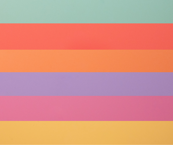
Pink, pale yellow and light blue have one thing in common: they are all pastel colours. In contrast to secondary and primary colours, pastel tones appear softer, paler and calmer. They are the opposite of strong colours and often ensure a tasteful design when used. That's why pastel colours can have a particularly aesthetic effect. Designers, artists and painters use the colours in a wide variety of areas.
What are pastel colours and how do they differ from other colour types?
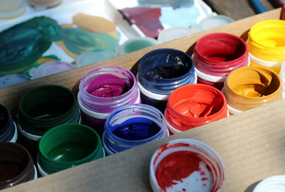
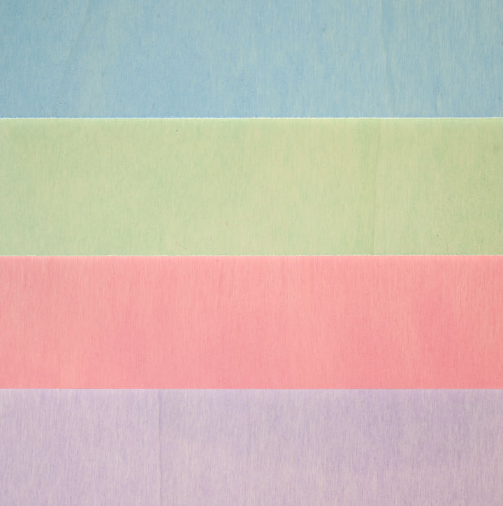
The main feature is that these colours have lower saturation than primary and secondary colours. A high proportion of white also plays a role. This makes the colours appear less bright and paler. Nevertheless, the bright colours represent the complete spectrum of the rainbow colours. These are just closer to white. This means that when you mix red with white paint, you get a pastel tone - usually a soft pink. But black paint can also be used to create pastel tones such as light gray.
The use of pastel tones in art, fashion and interior design
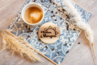
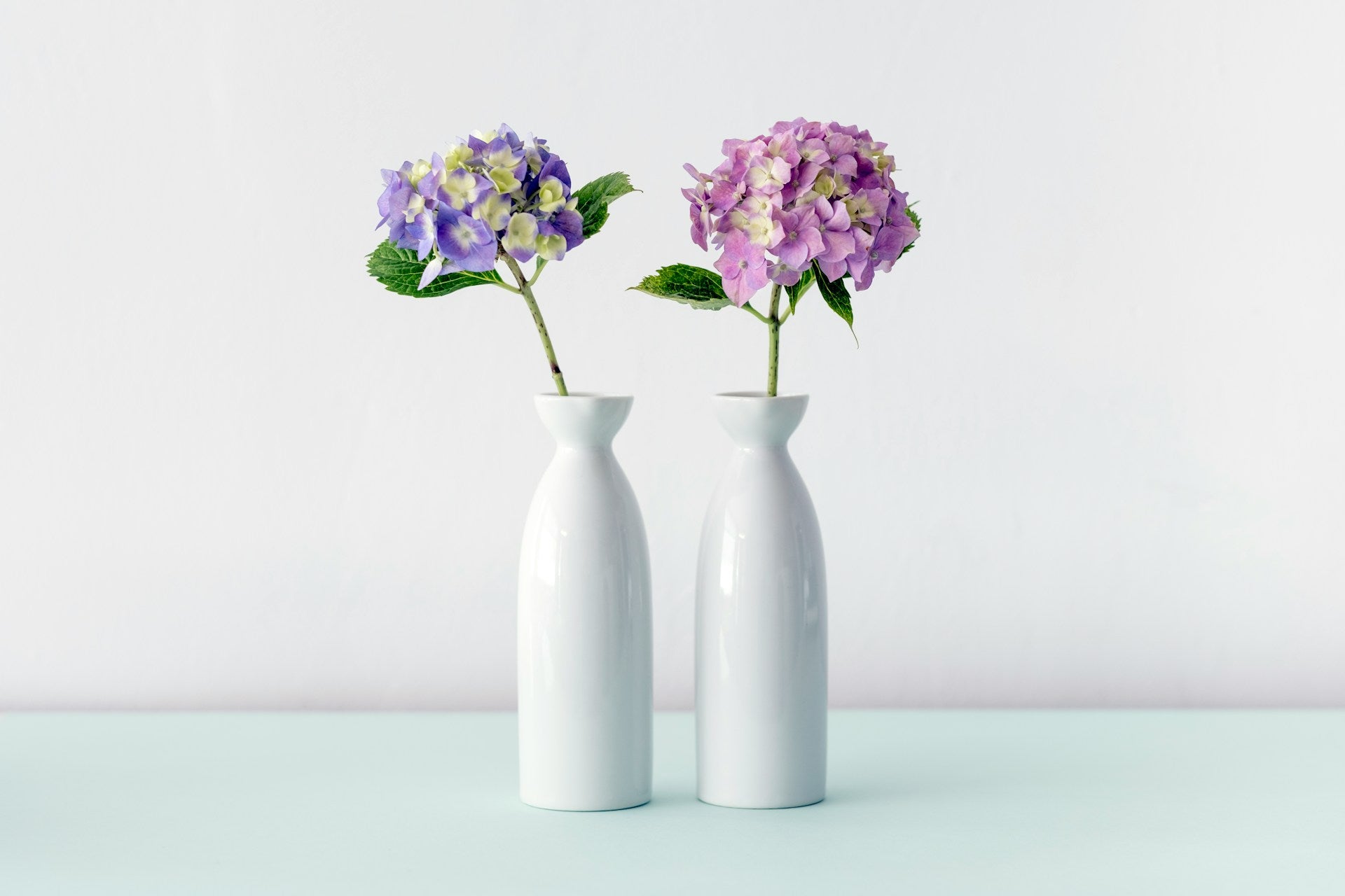
It is difficult to define a specific date when these colours were first used in fashion or design. Pastel in art has been used since at least the 15th century. You shouldn't equate pastel painting with today's wall or textile colours. Pastels are also available in bold colours such as black or blue. But the chalks also conjure up a delicate, light colour. If you have a closer look at the furniture and furnishings from the 1950s, you will notice that pastel tones were used during this time. Popular pastel colours of the 50s are pink, mint green, but also light yellow and light blue. Pale colours, which are said to have a calming effect, have been in trend again and again since this decade. In art as well as in fashion. The interior design also benefits from light walls in pastel tones or furniture pieces in delicate, pale colours.
Some areas of application at a glance
For example, in 2024, pastel colours will be trendy in fashion. Vogue published an article about this on September 24, 2023 and names pastel tones such as lilac and pink as trend colours. These colours also play a role in interior design. These colours can be used to set accents. Pastel colours also have an impact on the mood. Depending on which pastel shade you choose, you can achieve different moods. While strong colours can have an invigorating effect on people, pastel colours are said to have a calming effect. A mix of yellow and green can provide freshness. Light gray and light blue colours in combination, on the other hand, appear cooler and less playful. These colours are suitable for painting in the bedroom, for example. These colours are not only popular in interior design or fashion. Designers use pastel colours, among other things, for a subtle representation. However, this cannot be generalized.
This is how you get the best out of the colours
Pastel colours can stand alone or can be combined with bold colours. A strong brown goes ideally with a light, light blue pastel tone. This combination as a wall colour has a warm and grounding effect on us. To get the most out of pastel colours, it's important to think about what you want to achieve. What effect should your product ultimately have? Is this a specific design? For example, you clarify the design of a company in advance, asking yourself: Do light colours suit the company or is it advisable to use strong colours? This depends on which colour use is suitable for you.
Current trends and possible uses

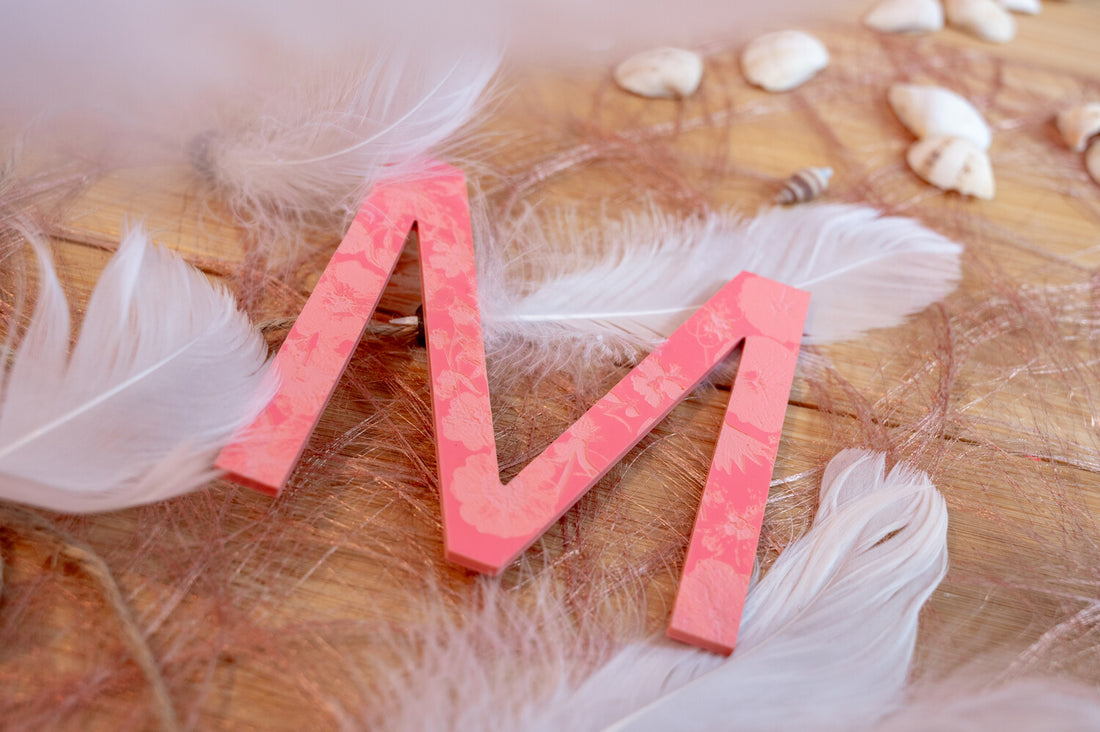
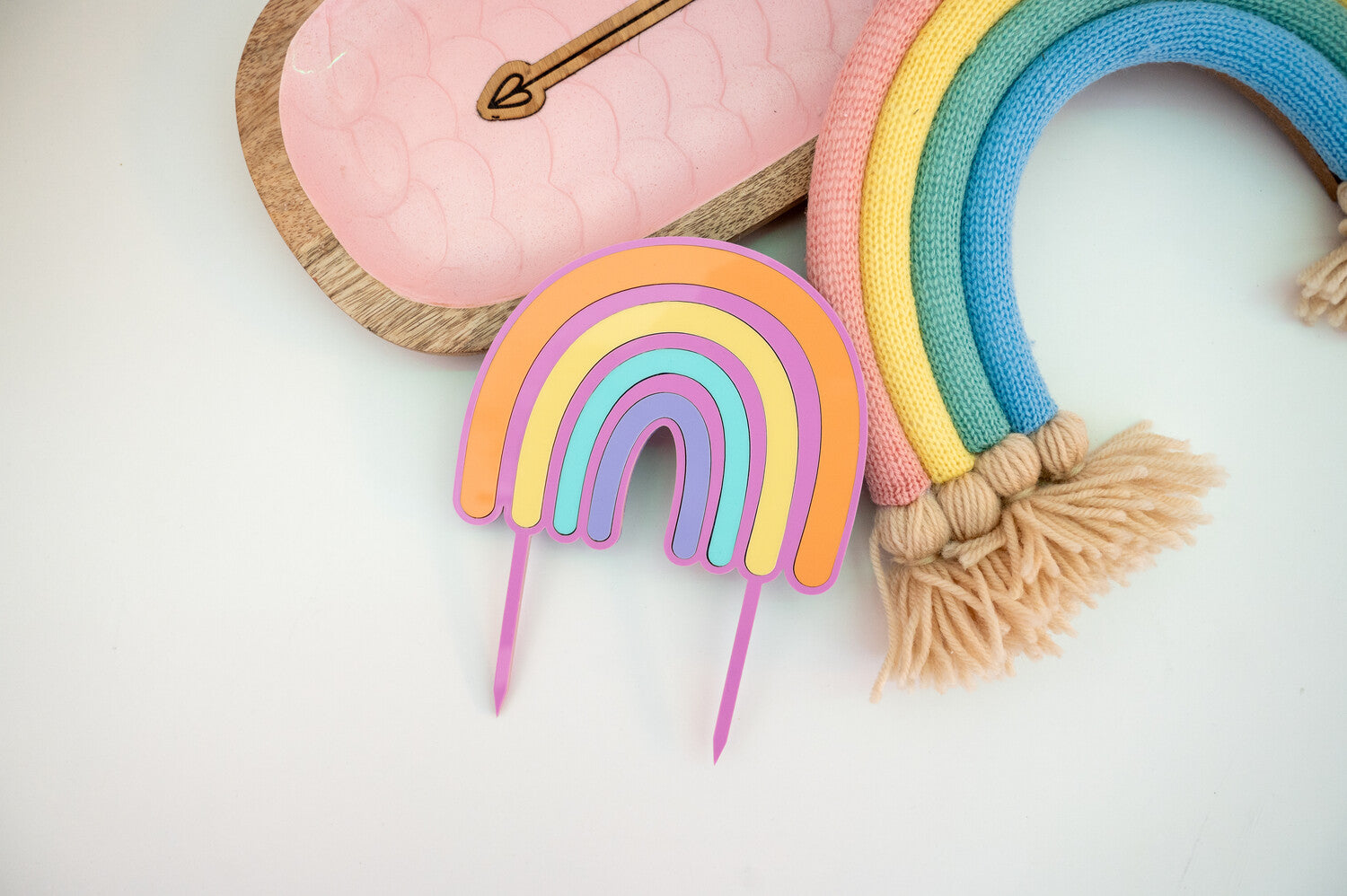
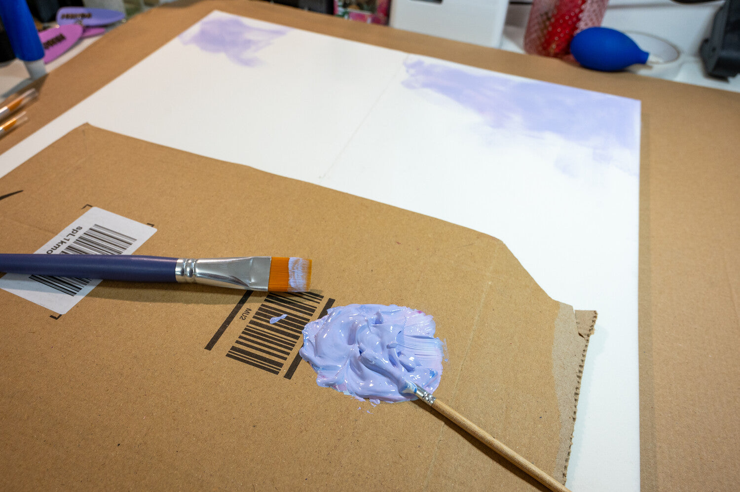
Pastel colours are particularly popular in interior design and in the fashion industry. But pastel tones are not only used here. Some companies also use these colours in their corporate design. Of course, in this case, the soft colours have to match the company itself. Pastel colours are also always a craft trend in the DIY sector. These colours can be used to conjure up creative gift ideas or decorative materials, among other things. Whatever your next project may look like: we support you with our products. A laser cutter is able to process various materials. This means there are almost no limits to your ideas. If the use of pastel colours is important to you, we stock pastel acrylic and pastel poplar plywood in our online shop. This can be easily processed with the Mr Beam laser cutter. With the help of these materials, creative projects can be implemented: for both children and adults.

Mr Beam poplar plywood 3mm, pastel, A3, economy pack (4 colors)
Sale price
€ 65,90 EUR
Mr Beam poplar plywood 3mm, pastel (various colors)
Sale price
From € 21,90 EUR
Mr Beam Pastel Acrylic, various colours, 3mm, A3
Sale price
From € 14,90 EUR
It's all in the mix!
Pastel tones can be combined in many different ways. Pastel colours have been used in art for several centuries, including in the form of pastels. However, they differ from the current trend of pastel colours in terms of colour intensity. Because the pastel in painting can be darker. The pastel colours used in fashion or interior design, on the other hand, are characterized by their high white content. Depending on how you combine the colours together, you get different moods. By playing with the colours, you will find out which mixture is right for your creative project. Of course, soft pastel tones can also be combined with strong colours. It's best to just try it out for yourself! A little tip on the side: Pastel tones can also be a real eye-catcher as wedding colours !